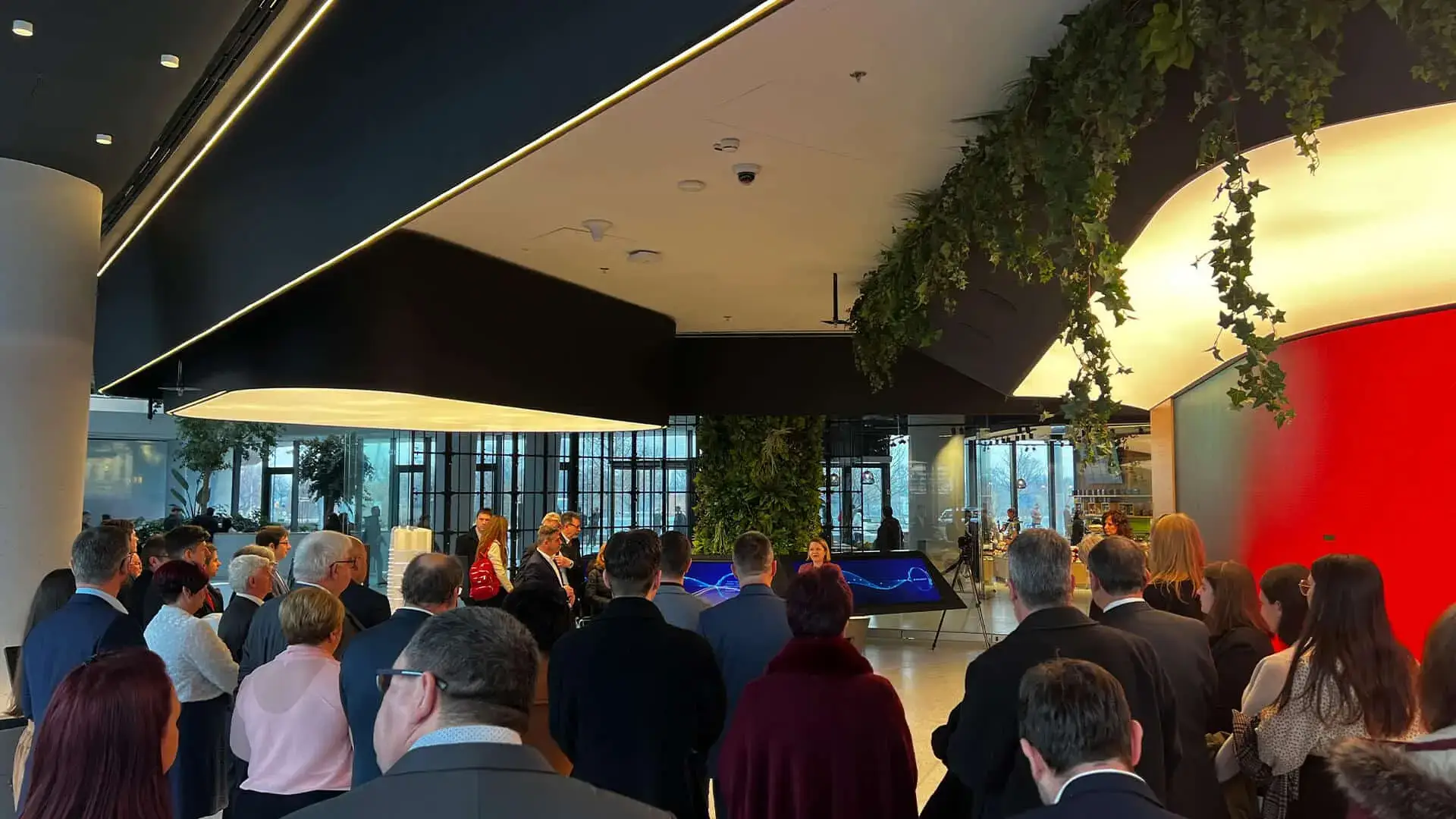
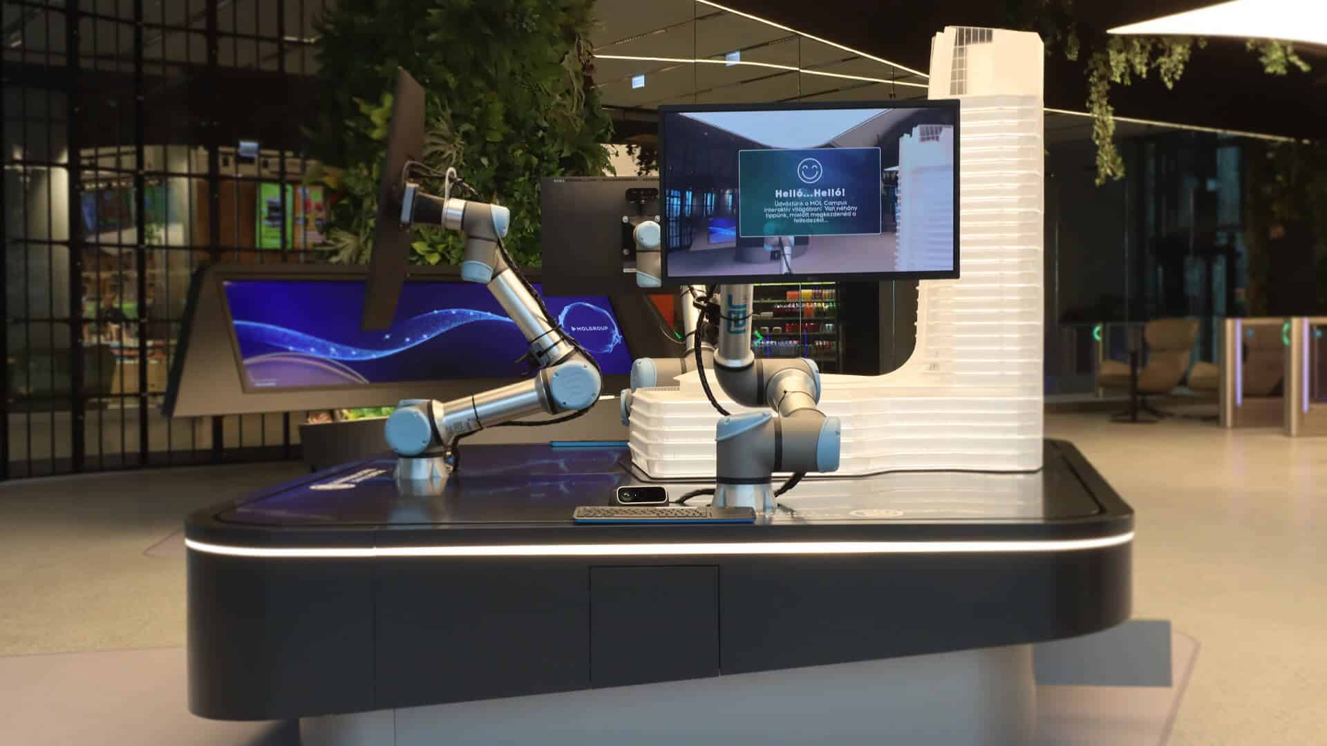
Data visualisation at scale
The third experience translated MOL Group's sustainability metrics into a navigable visual system. Rather than a dashboard, we designed something closer to an explorable map: visitors could move through the data spatially, surfacing relationships between energy, emissions, and investment that a chart cannot show.For a corporate visitor centre, the data visualisation carries the heaviest communicative load. It is the piece stakeholders return to and the piece that appears in briefing photography. We tested readability and accuracy in parallel, with sign-off loops built into the delivery schedule. The result is an installation that works as communication, not just as spectacle.